In this case study I want to show you how I created a set of widgets for mobile devices and a different set for desktop and tablet devices. Building widgets for mobile devices is not too hard once you know the procedure.
Background
We all know that mobile device browsing is growing at a huge rate, and that your website had better support mobile devices. It is incredibly important that your site has a good responsive theme, but sometimes settings for a desktop site aren’t quiet right on the responsive side of things.
This case study is for my own site wpdude.com, on the home page I have a series of widgets, I use them to show my client portfolio and my recent blog posts. I’ve got nine random client listings, which looks great on a desktop or tablet.

You can very easily scroll down through the nine items with a wheeled mouse, the problem arises when I look at my site on my phone, I’m scrolling through acres of screen real estate to get past nine testimonials, so my problem was how to limit that number on mobile phones only and keep that valuable social proof for larger screens.
Enter Widget Logic
I’ve written about the great plugin widget login in this post, but in summary widget logic allows you to apply logical conditions to sidebar or in my case home page widgets and only show those widgets when the condition is met.
If only there was a condition that allows me to show only when a device is mobile …
Enter WP_IS_MOBILE()
There is a function inside of WordPress called wp_is_mobile(), what this does is examine the user agent of the device browsing a website and will return TRUE or FALSE depending upon whether the device is a mobile one.
The user agent is a piece of data all browser send to a website, so you desktop will send the fact you are using Google chrome from windows machines, your Mac will say safari, and your phone does exactly the same. This is how WordPress knows there is a phone browsing your site.
WP_IS_MOBILE() defines mobile devices as phones only, larger screen tablets will return FALSE.
What I Did
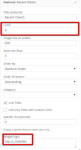
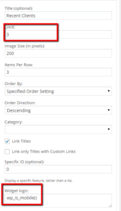
I created two widgets to show testimonials, one had widget logic set to !wp_is_mobile() and the other set to wp_is_mobile(), it might not be immediately apparent what the difference is, but adding ! translates to IS NOT mobile. Here are screen dumps of both widgets


If you check my site on a mobile device you will only see three featured clients. What is happening is that the wp_is_mobile is returning TRUE so that widget is displayed.
Wrap Up
Mobile is incredibly important, ignore configuring your site for optimal mobile browsing and you risk loosing potential customers for your products or services.
Photo Credit: rmtx via Compfight cc

