Is Your WordPress Site Small Screen Ready? This is a question all WordPress site owners should be asking themselves.
Mobile access to content is soaring people are using their phones more and more to consume web pages.
You need to be able to cater for these site visitors, you need to create a quality user experience
Don’t Be Precious About Design
Mobile user don’t give a rat’s ass about your perfectly proportioned, white space positive, pixel perfect desktop design, they need functionality.
Think functional not beautiful design. Think user experience, not does it look pretty.
Want proof, pull out your phone right now and open your favourite app. Things are close together, much is reduced in the native app that might be available on the web app. UX or user experience wins on a small screen. I’m not saying design does not matter on a mobile experience it does, but it takes second place to usability.
Think About Fingers Not Mice
On a small scene people are going to be touching, and swiping not accurately positioning with a mouse.
A finger tip and it’s pointing ability is massive compared with a tiny mouse pointer, can it be touched as easily as it can be clicked?
Menus
On desktop we have wide ranging even sprawling menus, that driop down and expand into hgue amouts of white space ont eh desktop
That is just not something you have the liberyty to do on mobile.
Create a cut down responsive menu (check out this plugin https://en-gb.wordpress.org/plugins/responsive-menu), additional tip I would consider this for my tablet view too.
Consider not showing certain menu items that are not useful to mobile viewers.
Buttons
I’ve already mentioned the use of fingers rather than mouse pointer, you should give lots of thought to the size and positioning of any buttons your site may have.
I’ve mashed my way through too many bad experiences with my own sausage like fingers on my phone.
Fonts
Your font sizes on desktop may work but could be wrong for a mobile device
Images
My current bug-bear are blog post images that are too wide for my portrait phone screen, I have to go into landscape, pinch and pull at images to resize and view them.
How To Achieve A Quality mobile experience
There are two main ways to get a quality mobile experience and that is via plugins or well written themes.
Check out the phone version of sites on popular theme marketplaces like themeforest.net.
My favourite quick fix for this issue is to install wp-touch plugin.
Check Your Site Today
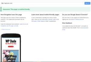
Is Your WordPress Site Small Screen Ready? Go and test it on the Google mobile readiness checker.
https://www.google.co.uk/webmasters/tools/mobile-friendly/

If Google go to the trouble of creating a toll like this it tells you mobile readiness is a factor in their rankings, Remember mobilegeddon?
Going Native
Just a parting word, is it worth while thinking about creating an App from your site rather than using a responsive website?
Apps work natively with iOs or Android and are design with small screens in mind. I’ve been thinking about this a lot recently, will we be moving away from browser based sites, will WordPress act as a back end system to power content to native apps that we will install on our phones.
The user can gain the benefit of native functions but still read their content. I think we will be going that way.
Personally I don’t consume content from a native website, I pull the content into my Feedly reader and consume it that way. I much prefer a native view of content to a website.
Wrap Up – Is your WordPress site small screen ready?
Is your WordPress site small screen ready? Like it or not our well designed and thought out websites are moving away from desktop browsers to tablets and phones, we need to give those people a better experience.
Test your site and get it mobile ready as soon as possible.

