Introduction – Mastering Mobile Checkout
In the ever-evolving landscape of e-commerce, mobile devices have become the go-to platform for a significant portion of online shoppers. As a WooCommerce store owner, ensuring a seamless and optimized mobile checkout experience is crucial for capturing and retaining customers. In this blog post, we’ll delve into strategies to master mobile checkout and enhance the overall success of your WooCommerce store.
Understanding the Mobile Landscape
Before we explore strategies, it’s essential to understand the mobile landscape. Mobile users have distinct preferences and behaviors that influence their online shopping experience. Factors such as screen size, touch navigation, and varying network speeds must be considered when optimizing the checkout process for mobile devices.
Strategies for Mobile Checkout Optimization
1. Responsive Design Principles
Implementing a responsive design ensures that your WooCommerce store adapts seamlessly to different screen sizes. Test your site on various devices to guarantee a consistent and user-friendly experience across the mobile spectrum.
2. Touch-Friendly Elements
Mobile users interact with their devices through touch, making it imperative to have touch-friendly elements in your checkout design. Buttons, form fields, and navigation should be easily tappable and responsive to gestures, providing a smooth and intuitive user experience.
3. Condense and Simplify
Mobile users value simplicity and speed. Streamline the checkout process by minimizing the number of steps and required form fields. Consider implementing an accordion-style layout or a single-page checkout to condense the entire process into a digestible format.
4. Optimize for Speed
Mobile users are often on the go and may face varying network speeds. Optimize your website and checkout process for speed by compressing images, leveraging browser caching, and minimizing unnecessary scripts. A fast-loading site contributes to a positive user experience and can prevent potential customers from abandoning their carts.
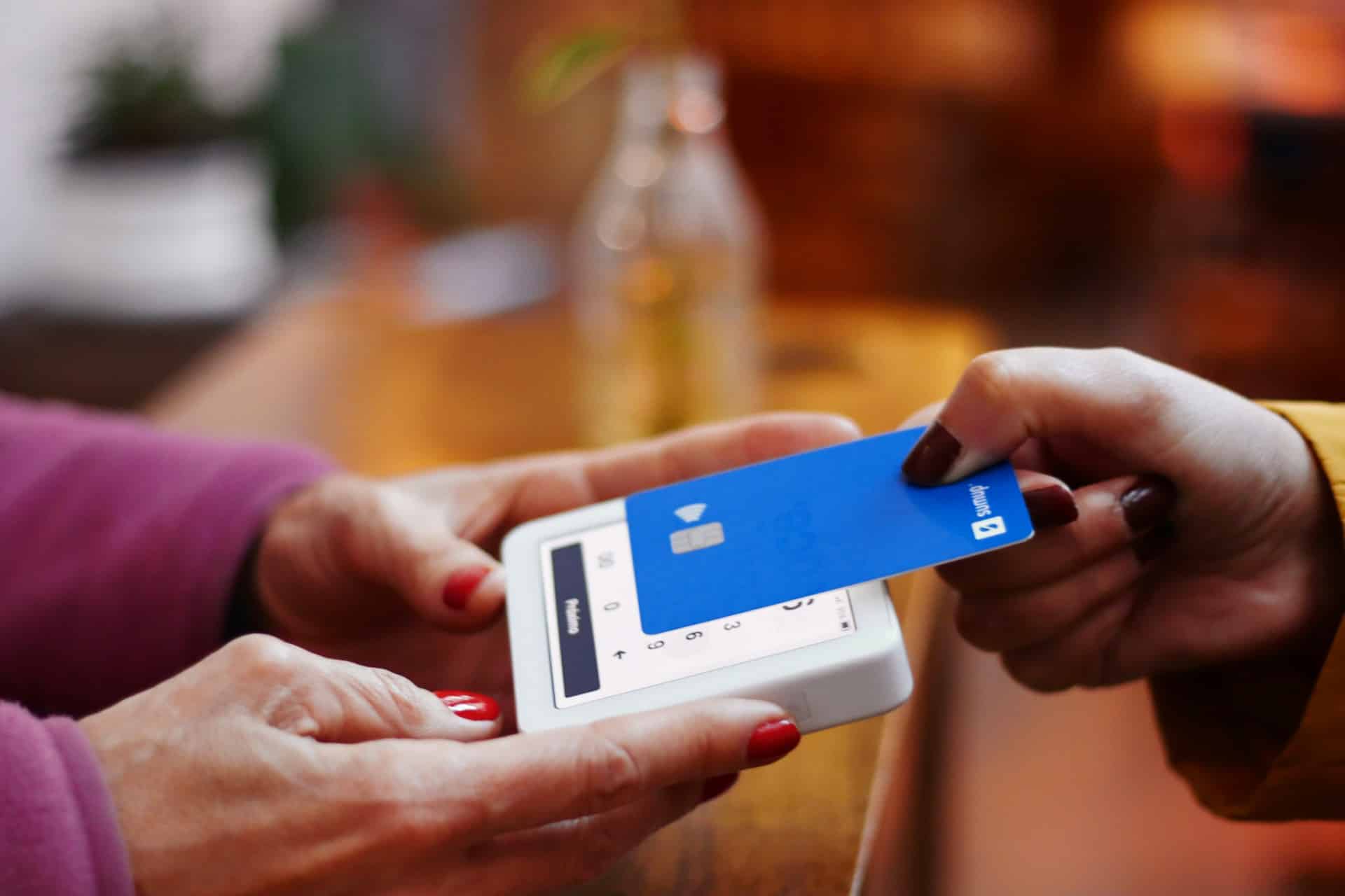
5. Digital Wallet Integration
Simplify the payment process by integrating digital wallets such as Apple Pay, Google Pay, and PayPal. Digital wallets provide a convenient and secure way for mobile users to complete their purchases without the need to manually enter extensive payment information.
Testing and Iteration
Regularly test your mobile checkout process across different devices and browsers. Pay attention to user feedback and analytics data to identify any pain points or areas for improvement. The mobile landscape is continually evolving, so staying proactive in testing and iterating is key to ongoing success.
Real-World Examples
Explore successful WooCommerce stores that have effectively mastered mobile checkout. Highlight their strategies, user interface designs, and any specific features that contribute to a seamless mobile shopping experience.
Conclusion – Mastering Mobile Checkout
Mastering mobile checkout in your WooCommerce store is not just a trend; it’s a necessity. As mobile usage continues to rise, providing a frictionless and optimized mobile checkout experience is a strategic investment in the future success of your online business. By implementing responsive design, touch-friendly elements, and streamlined processes, you’ll not only meet the expectations of mobile users but also increase conversions and customer satisfaction in the competitive e-commerce landscape.
Photo by Nathana Rebouças on Unsplash